


Fair Maiden
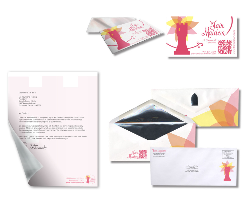
Fair Maiden is a beauty and hygiene company. The target audience for this brand is preteens and teenage girls. For the branding of this company, I was inspired by the damsel in distress with long hair, Rapunzel. I chose the rook as a symbol to give the brand a little edge. I wanted to balance the hard lines of the rook with the softness of the overlapping flower petals.
For the corporate identity I thought about what would be useful in terms of a woman keeping in her purse. A mirror suited my purposes perfectly. So I designed the business card to be a pocket sized mirror with the business card on the front of it.
I carried this motif over to the letterhead by backing the executive stationary with a silver foil. The theme continued through the envelope where I envisioned a silver foil liner adhered inside the flap of envelope. The envelope itself would have a die cut of the window from the rook on the flap, when fully assembled the die cut will reveal the foil on the inside of the envelope. This stationary would be very expensive and only reserved for the executives of Fair Maiden as well as V.I.P. clients.
